Locked down during Spain’s second or third COVID wave and nervously anticipating elections in the US, I sat down to build a very simple React app as a demo for something I was working on.
I was immediately paralyzed by the question of how to style the application.
There was no good reason for this to be a showstopper. It wasn’t particularly important how this demo app looked, and the underlying technology used to style it mattered even less.
But I found myself unwilling to proceed, fundamentally dissatisfied with basically every approach I’d ever used: Every UI framework, every component library, every CSS methodology — they all seemed to fall short of doing what I needed, and I didn’t want to just pick something familiar and move on.
Maybe my obstinacy was due to the Difficult Times We’re Living Through.
But what I ultimately want to create are interfaces that users can modify or assemble from scratch using interchangeable building blocks. To pull this off, I’ll need a solid underlying design system that is modular and composable.
And in this case the developer experience of styling matters more than it normally would, because ultimately I’d like for it to be easy for advanced users to extend the system by creating new datatypes — along with the components for working with them. So the whole question of how you balance customizability with keeping the design good and appealing and consistent is super important. The design system needs to be flexible in all the right places, while making it easy to create things that look great and hard to make ugly things.
UI libraries
My first thought was to take a look at the current state of UI component libraries.
About a decade ago, I went all-in on Bootstrap — as did seemingly every other web designer in the planet.
Bootstrap was originally an internal project at Twitter, intended to reduce duplication and encourage consistency across various parts of the application’s UI. When they open-sourced it, it became hugely popular – to the point of becoming the default choice for new websites and web apps, and causing some to complain that every website looked the same.

Bootstrap defined the visual style of the web for the better part of a decade.
Bootstrap provides ready-made grids and templates; a library of individual elements like buttons, alerts, and forms; and a handful of interactive components like dropdowns and modals. It’s a solid choice; DevResults still uses Bootstrap to this day.
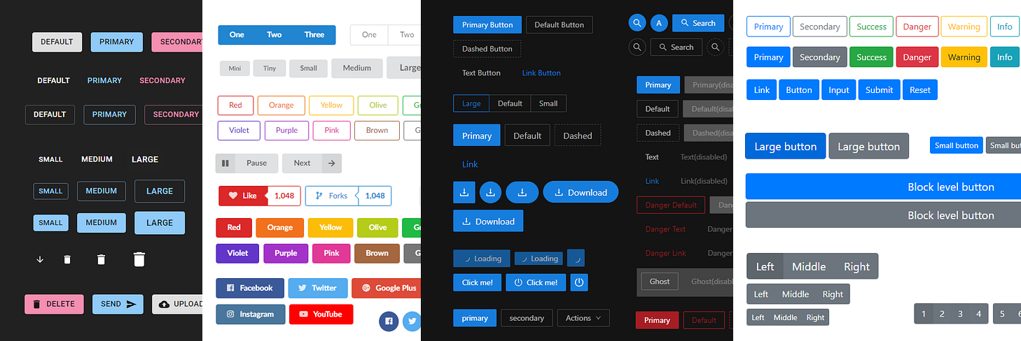
UI libraries vary widely in terms of how many components they offer and which ones, but they all start with buttons. Shown here, from left to right: Material UI, Semantic UI, Ant Design, Bootstrap.
Bootstrap is still far and away the most widely used UI framework, but there are other options that have become popular as well:
- Zurb foundation is a more minimalist framework that came out around the same time as Bootstrap.
- Material UI is an unofficial, community-created implementation of Google’s Material Design.
- Semantic UI is a sharp, simple library that I’ve used in the past but that seems to be struggling a bit to keep up with the times.
- Ant Design is a product of Ant Financial, which I gather is the PayPal of the Alibaba universe. It’s very widely used in China.
Design systems
The problem with UI component libraries like Bootstrap is that they leave the designer without any guiderails when they need to create completely new components.
In a large codebase, maintaining visual consistency carries a significant cognitive load, and it’s easy for things to diverge in lots of directions. Even with a world-class design team, you can end up with a lot of unwanted inconsistency.
Adam Wathan catalogs some examples of the crazy profusion of styles on some well-known sites:
- GitLab has 402 different text colors.
- ConvertKit’s site has 70 different font sizes.
- GitHub uses a total of 147 different background colors.
This is where you end up when every new chunk of CSS you write is a blank canvas; there’s nothing stopping you from using whatever values you want.
Good design requires constraints. Grids and palettes are useful design tools because they limit our choices.
Many organizations have addressed this need by creating a design system.
Superficially similar to a UI library, a design system might include a set of pre-designed components like buttons, modals, and dropdowns. But since you can’t foresee every component that people are going to need, the focus is at a lower level: A design system offers a set of composable elements, called design tokens. These might include everything from type styles and color palettes to line weights, drop shadows, scales for spacing, and so on. These can be combined in different ways to create completely new components and layouts in a way that’s visually consistent with other components and with the organization’s overall brand.
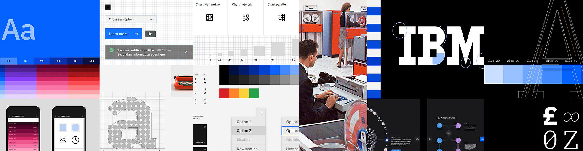
I’ve always thought IBM’s Carbon design system was particularly sharp, and I use the IBM Plex family of typefaces a lot — including on this site.
Many companies have open-sourced their design systems: Microsoft has Fluent UI, Salesforce has Lightning, Shopify has Polaris, GitHub has Primer, IBM has Carbon, and so on.
Some of these are really internally-facing and seemingly open-sourced just for the hell of it; while others are intended for wider adoption and customization.
Google’s “Material Design” system was my introduction to the concept, and it really straddles these two modes: Its original intention was to unify Google’s sprawling universe of applications. But Material embodies a set of lower-level principles that can be adapted to any graphic identity, and it has been used as the foundation of in-house design systems for many organizations, from Lyft to NPR to Zappos.

Material Design is kind of a meta-design system: It has been used as the foundation of many non-Google brands’ design systems.
In my experience, though, customizing the design of an existing framework like Bootstrap or Material UI is a nightmare. Bootstrap’s CSS contains literally eleventy million billion variables. It’s death by a thousand overrides, as you struggle to overlay your vision on top of an endless supply of someone else’s decisions.
The question of how you modify an existing set of styles brings us to an extended digression on an important topic, which is…
The beauty and the terror of working with Cascading Style Sheets
The DevResults codebase has around 17,000 lines of our own CSS, plus something like 6,000 lines from Bootstrap.
I’m sure I’m not the only one on my team who has experienced a familiar sinking feeling whenever it comes time to touch the application’s CSS. Whether the task at hand is fixing a display bug, updating the design, or creating a new component — there’s a sense of dread, rooted in the fear of breaking something — which in turn comes from a sense that it’s impossible to completely understand or predict the effects of any given change.
There should be a German noun for the fear of breaking something in a CSS codebase.
I used to think it was just us, that this was our fault: Surely if we were using better conventions, perhaps if we organized things better, maybe if we had abstracted the right abstractions, then we would enjoy working with our CSS.
But it turns out that large CSS codebases are pretty much universally dreaded and feared by the very people who created them, no matter how competent they are.
Case in point: If anyone knows what they’re doing with digital design, it’s the people at The Guardian. Their web presence been an inspiration to me for many years, with a confident and distinctive design sense that’s woven across an amazing variety of digital contexts with remarkable consistency.
And just six years after they started over from scratch, they describe their codebase over 60,000+ lines as a “precarious, teetering, maintenance nightmare”.

This is hard even for the pros: The Guardian has long been a leader in digital design and typography. If they feel overwhelmed by their CSS codebase, what hope is there for the rest of us?
Now of course, any kind of legacy code can be nerve-wracking to work with. But there are some peculiarities of CSS that make it particularly fraught.
The perils of globalization
The “C” in CSS stands for “cascading”, and the cascade is a powerful device: Changing one small rule can can have sweeping effects. This system of inheritance and overrides makes it possible to style a page elegantly and concisely. It’s rigorously logical and can be very satisfying to work with.
The flip side of the cascade’s power, though, is that if you have more than a handful of rules, you can quickly end up with a network of effects and counter-effects that exceeds your ability to keep it straight in your head.
The root of the problem is that all CSS is global. “Avoid global variables” has forever been at the top of the list of best practices for programmers, but CSS is, by its very nature, a global list of rules. Those pages and pages of Bootstrap variables? Every single one is global.
Not only do all styles exist in the same global namespace, but rules can “see” the entire DOM, and you don’t know in advance what the DOM will contain; so it’s not possible to compute in advance what rules might be applied in what combinations. This is not merely a difficulty, it’s a problem of fundamental unknowability.
One consequence of that is that it’s impossible to delete dead code, because you can’t be sure whether any given CSS selector is used or not. As a result, CSS codebases are, in practice, append-only.
In an article entitled Oh No! Our Stylesheet Only Grows and Grows and Grows!, CSS guru Chris Coyier describes the lengths one team goes to: They instrument their production site to analyze a sample of real page loads and report back which CSS selectors seem to be unused. But even this extreme approach just provides an educated guess — there’s just no way to test every possible page in every conceivable state of user interaction:
imagine some CSS that applies only to a select menu, for a logged-in user, with an expired subscription, who wants to update a credit card, in a modal window, with a form that displays a certain way because the card is American Express.
The same problem applies to modifying existing selectors: You can’t be sure what the effects will
be. So we all approach CSS changes with trepidation, never changing or deleting, only adding, and
keeping our additions as focused as possible — and consequently ramping up specificity in a
never-ending arms race, with nuclear !important statements proliferating out of control.
Reining in CSS’s global scope
Most programming languages have solved this problem organizing code into modules, each with its own scope. This makes it so that an ordinary human only needs to reason about one self-contained part at a time. There are a couple of ways to achieve this with CSS:
Naming conventions
In the absence of true modules, you can always just fake it by prepending your global variable names with a probably-unique string, add in lots of underscores for good measure, and hope for the best.
The BEM methodology, from the Russian search engine Yandex, is a popular naming convention for CSS that does just that. Class names always start with a block name — essentially a namespace at the component level — followed by an element name, and optionally a modifier. For example:
.bio__image { ... }
.bio__name { ... }
.bio__name--hover { ... }
.article__image { ... }
.article__title { ... }
.article__title--hover { ... }
This works well as far as it goes, but it’s brittle. As The Guardian’s front-end team observed,
Systems that try to contain complexity over long periods of time by convention will inevitably tend toward entropy, because one significant characteristic of convention is that it is trivially simple to break one.
CSS Modules
Well, if the problem with conventions is that they require discipline and consistency from undisciplined and sloppy humans, that’s why we invented computers. Rather than cajole and persuade developers and then hope against hope that they nobody screws things up, we can just give the job of naming things to a computer.
CSS Modules, a build-time tool created by Australian
developer Mark Dalgleish, basically automates a BEM-style prefixing scheme. It lets you break your
stylesheet up into component-level files, and then namespaces them by prefixing them with the
component’s filename. So for example, a style named title might be replaced with one named
_article__title_309571057.
CSS in JavaScript
But what if, instead of creating a new pseudo-module system for CSS, we just used the module systems that we already have in JavaScript?
These kinds of ideas usually just sneak up on us little by little. The whole CSS-in-JS thing is unusual in that one day it was not a thing at all, and seemingly overnight there were thousands of blog posts, opinion pieces arguing for and against, tutorials teaching you how to do it, and dozens of brand-new frameworks experimenting with the idea.
The precipitating event was a talk that React developer Christopher Chedeau (Vjeux) gave at a small JavaScript conference in Washington DC at the end of 2014. It’s worth watching in full:
In spite of the somewhat muffled audio, this is a really compelling presentation. I can’t imagine Chedeau went into the talk thinking it would be such a watershed.
The original idea was fairly simple: Rather than have your CSS in a separate, global file, you assign styles directly to elements within each component.
<div
  style={{
    backgroundColor: danger ? 'red' : 'green',
    height: 10,
    width: 10,
  }}
/>
These are then rendered as inline styles:
<div style=`background-color: red; height: 10px; width: 10px` />
Modern CSS-in-JS libraries do a little fancy footwork in the background to dynamically roll these
styles into proper CSS classes (with randomly-generated names). This allows you to use basic CSS
features like hover states that you wouldn’t be able to support with pure inline styles. For
example:
<div
  css={{
    backgroundColor: 'red',
    height: 10,
    width: 10,
    '&:hover': { backgroundColor: 'blue' },
  }}
/>
Which would render something like this:
<style>
  .eujXCt {
    background-color: red;
    height: 10px;
    width: 10px;
  }
  .eujXCt:hover {
    background-color: blue;
  }
</style>
...
<div class="eujXCt" />
By putting styles in the same JavaScript files that generate the markup, you make several of CSS’s seemingly intractable problems go away as if by magic. Styles are strictly scoped to their component. When making styling changes in one place, you no longer have to worry that you’ll unintentionally mess something else up. Dead code is no longer a concern.
The key insight of React and other modern rendering engines is to think of UI as a function of state. In the original model, UI meant just HTML, with the CSS living on a separate, static, global plane. But that segregation never made a whole lot of sense, and I think that’s why Chedeau’s presentation was an epiphany for so many people. HTML and CSS are two inseparable sides of the UI coin and it’s useful to think of them both as a function of state.
Understanding the ensuing drama
Of course, the front-end development community took the CSS-in-JS revolution in stride and everyone lived happily ever after.
Hahahahaha!! Just kidding. People’s heads LITERALLY EXPLODED. What followed was the division of the profession into opposing camps, followed by years of vitriolic debate, bitter recriminations, name-calling, bad memes, and snarky tweets. Friendships were destroyed. One widely-circulated article described CSS-in-JS as a bad-faith effort to perpetuate male privilege. There was a great gnashing of teeth and darkness fell across the land.
How we got here
To understand why this turned out to be such an emotional question, it’s worth taking a quick look at the history of CSS and web standards.

Gather around for a little history, kids.
The first time I wrote an HTML page was in 1995, before CSS was a thing.
In 1996, Internet Explorer 3 came out with the first browser support for CSS. I tried it out with great excitement, although it didn’t work in Netscape so I couldn’t use it for anything real.
Around 2000, the first websites I made for money used just a smattering of CSS for styling, most of
it inline. Like everyone else at the time, I used carefully sliced-up images, tucked into
elaborately nested <table> structures, to pull off effects like rounded corners and drop shadows.
In my defense, browsers sucked and there wasn’t really an alternative.
In 2003, a manifesto and a website changed things forever. The manifesto was Jeffrey Zeldman’s cranky masterpiece Designing With Web Standards, which exhorted the industry — browser vendors as well as web developers — to get its shit together. And the website was the CSS Zen Garden, which vividly demonstrated the power of CSS.
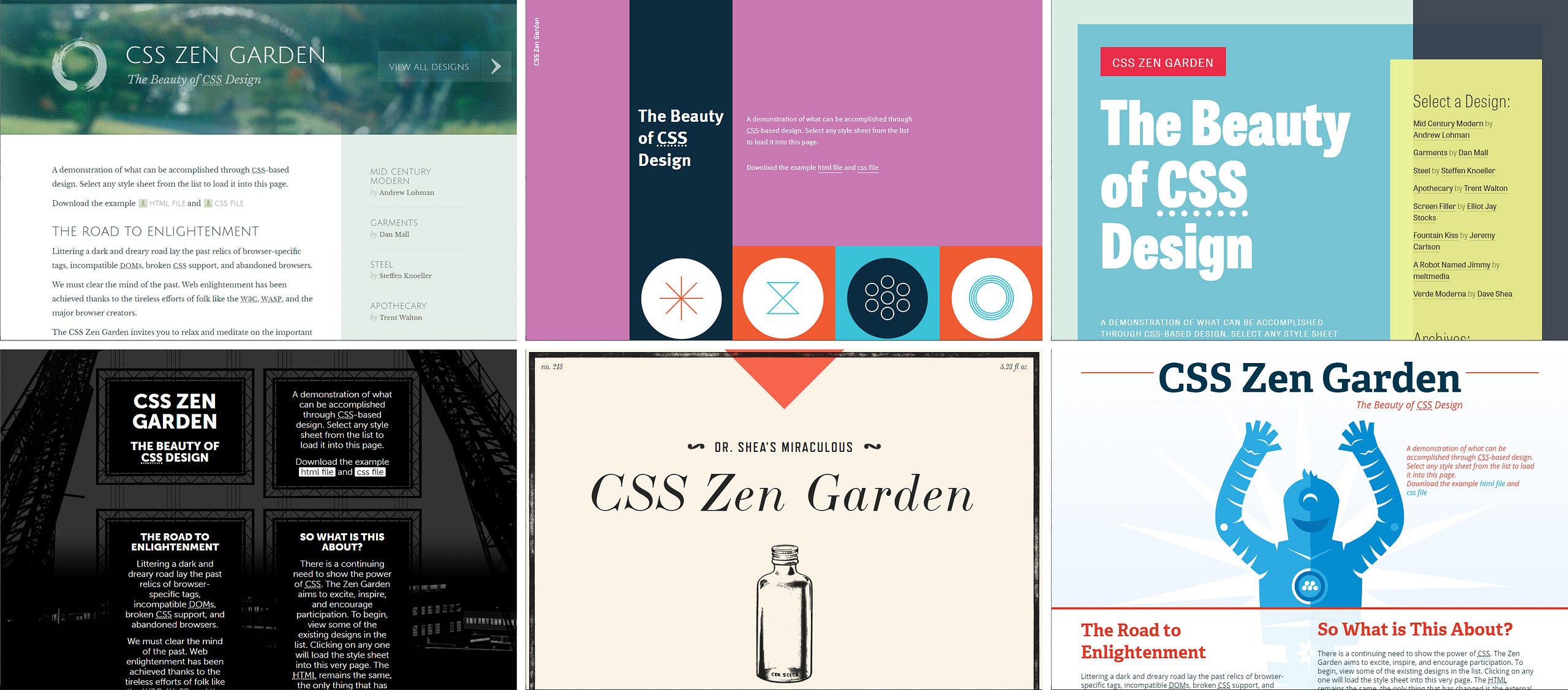
A vivid illustration of the power of CSS: The Zen Garden popularized the idea that you could redesign a website just by swapping out its stylesheet. It was hugely influential in getting designers and developers to embrace web standards.
The CSS Zen Garden is a website made by David Shea, a Canadian web designer. It consists of a single bare-bones HTML file, radically restyled in different ways simply by changing the stylesheet. Thousands of people submitted designs. Minds were blown, including mine.
Zeldman cofounded the Web Standards Project, an advocacy organization that managed to persuade browser vendors to adopt web standards, and to persuade web developers to write HTML and CSS that took advantage of these standards.
It’s hard to overstate what a huge and positive difference these people made to the landscape of front-end development. Before they came around, every browser did things differently, and it could be a soul-destroying enterprise to get things to look consistent across platforms. By 2013, the Web Standards Project was able to close its doors, claiming victory. The innovation and improvement we’re used to seeing every year in the CSS and JavaScript standards wouldn’t have been possible without them.
There are a couple of key principles that they got web developers like me to internalize like they were religious dogma:
-
Separation of concerns: The structure (HTML), presentation (CSS), and behavior (JavaScript) of a web page should be kept separate in their own tidy files. No more slapping messy little fragments of JavaScript and CSS hither and yon throughout our HTML.
-
Semantic HTML: HTML markup should be agnostic about styling. Class names should not refer to the desired styling for an element (
.big-red) but to its content and purpose (.alert-message).
These ideas durably changed the way we worked, for the better.
So you can see why some might be scandalized by the idea of discarding the stylesheet and using JavaScript to apply inline styles: It seemed like a return to the dark ages of Internet Explorer 6 (shudder). Complaints about the difficulty of working with CSS were seen as ungrateful attacks on the whole web standards movement.
It’s also important to understand that the separation of concerns between HTML, CSS, and JavaScript fit in comfortably with a natural division of labor between designers on the one hand, and programmers on the other: You do your stuff in your files, and I’ll do my stuff in mine. So you can see how it might be alarming to see JavaScript progressively eating more and more of the landscape: First came React and JSX, stirring HTML markup into code as if God was dead and nothing was sacred. And now the brogrammers on the JavaScript side of the house were coming for the CSS as well. Were designers now going to have to learn to code to keep their jobs?
Software applications are not documents
But the web was originally conceived as a way of publishing hypertext documents — where there’s a fairly limited universe of possibilities.
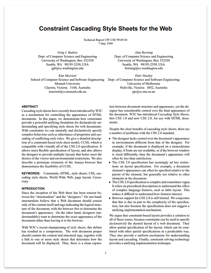
Isn’t it ironic: HTML and CSS were originally designed for publishing academic research — which are the one form of content that you’re least likely to find published as web pages today — even papers on HTML and CSS!
Stylesheets are an excellent solution for formatting static prose. This remains a context where principles like “separation of concerns” and “semantic HTML” make eminent sense.
But today’s web would be unrecognizable to the authors of the original HTML and CSS specs.
JavaScript, once a toy, is now the engine behind most of the web. Interactivity is the norm, not an optional enhancement.
Most significantly, the web is now a vehicle for delivering full-fledged software applications — in fact it’s one of the most important software platforms there is. Most websites — even ones that have written text as their core offering — are more like applications than they are like documents.
And web technologies used to build applications that aren’t even delivered via the web: Just looking at the applications installed on my iPhone and on my Windows laptop, a great many of them — from Slack to Spotify to VS Code — are made using HTML, CSS, and JavaScript.
Should it surprise us that the tools used to publish an academic paper would be different from the ones used to build an application like Google Sheets? The two have as much in common as a microwave oven has with a newspaper.
Jeffrey Zeldman grouses crankily about the “cult of the complex”, longing for the days when designers could proudly point to “hand-coded, progressively enhanced HTML, CSS, and JavaScript they understand and wrote themselves”
If you entered web design and development in the past ten years, you’ve likely learned and may rely on frameworks. And what keeps the whole monkey-works going? JavaScript, and more JavaScript. Without it, your content may not render…
As our jerrybuilt contraptions, lashed together with fifteen layers of code we don’t understand and didn’t write ourselves, start to buckle and hiss, we blame HTML and CSS for the faults of developers. This fault-finding gives rise to ever more complex cults of specialized CSS, declaring CSS is broken, only to splinter as members disagree about precisely which way it’s broken, or which external technology not intended to control layout should be used to “fix” CSS. (Hint: They mostly choose JavaScript.)
But we’re trying to build a microwave, not publish a newspaper. The complexity is there whether we like it or not.
And taming complexity is one of a software developer’s most important jobs. Superficially, it may seem like you’ve added complexity when you replace a hand-crafted CSS file with a JavaScript-driven toolchain. But this upfront investment in complexity makes it possible to reason about the effects of your CSS styles by containing the scope of your changes to manageable, modular units.
Components, not classes, as the unit of abstraction: Components allow you to take a single element of data and bind it to any number of different presentation layouts — “presentation” meaning styles and markup.
A different separation of concerns
As for the “separation of concerns” encouraged by the Zen Garden, I’m not sure it was ever conceptually coherent: Your CSS and your markup are tightly coupled, because there’s presentation-level information encoded in the structure of your HTML — the order things are in, the way they’re nested. HTML markup is not pure “content” and never has been.
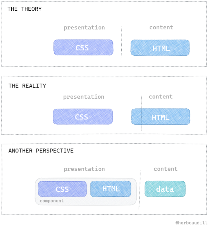
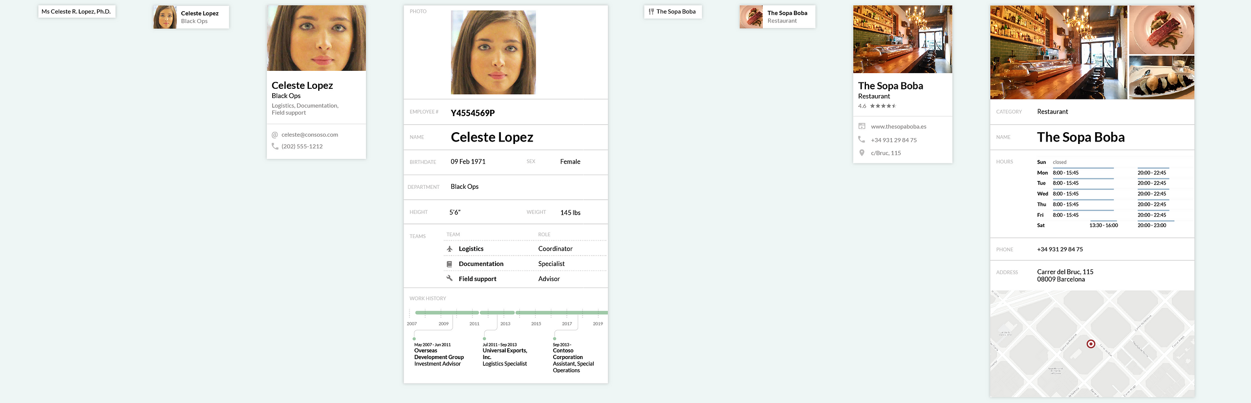
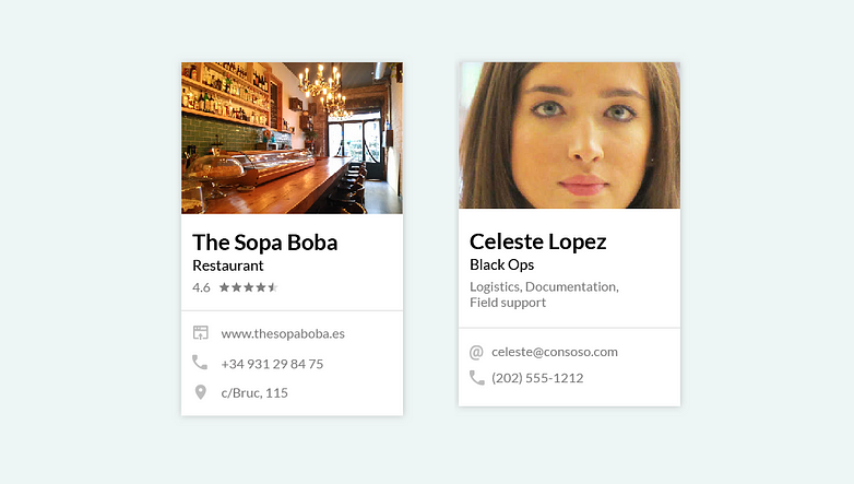
A couple of different ways of thinking about “separation of concerns”. An HTML document mixes content, structure, and semantics. If your data is separate from your markup — as it will be in any software application — it starts to make more sense to treat the styling and the markup as a single thing: a component.
In an application of any complexity, the meaningful boundary between presentation and content isn’t
between files with that end in .html and files that end in .css — it’s between components
(containing CSS, HTML, and JavaScript) and structured data. You can take a given piece of data – a
contact entry, or a restaurant’s details and reviews, or a blog post – and pour it into any number
of different components.

Designing with constraints
So, back to the real world. Let’s say we’re fine with the whole CSS-in-JS thing, with our styles scoped at the component level. That still leaves us with the 400-colors-of-text problem: How do we go about building a design system that ensures our changes will add up to a coherent whole by constraining our choices?
Theme UI
Theme UI came out in 2019, and it’s the first CSS-in-JS framework I found that explicitly sets out to be the foundation of a design system. Created by Gatsby developer Brent Jackson, it calls itself a constraint-based framework and builds on his previous contributions including BassCSS, ReBass, and Styled System.
Theme UI works on top of existing CSS-in-JS libraries to constrain choices to a set of pre-established design tokens. These are driven by a theme file.
// theme
{
  colors: {
    background: '#fff',
    primary: '#07c',
    warning: '#f00',
  },
  fontSizes: [12, 14, 16, 20, 24, 32, 48, 64],
  space: [0, 4, 8, 16, 32, 64, 128, 256, 512],
}

// component
<button
  sx={{
    color: 'white',
    bg: 'primary',
    fontSize: 2,
    px: 4, // horizontal padding
    py: 2, // vertical padding
  }}
>
  Click me
</button>
I was briefly pretty excited about Theme UI. In practice I’ve found it to be easy to work with. But it hasn’t exactly taken the world by storm, so there’s not much of a community or ecosystem around it.
And while it says it comes with 30 pre-built components, they’re kind of a random assortment and they’re mostly very low-level; so you’re pretty much on your own when it comes to actually building out the UI for an application.
Tachyons
The final piece of the puzzle for me came when I took a second look at the idea of “atomic” or “functional” or “utility-first” CSS.
Tachyons was the first such framework that I learned about. It has a lot of overlap with Theme UI, both in its motivation and in its history: Its creator, Adam Morse, is a long-term collaborator of Brent Jackson. Like Theme UI, Tachyons describes itself as a constraint-based framework, and it’s driven by a theme file in which you define your design tokens.
// theme
{
  "typeScale": [ 3, 2.25, 1.5, 1.25, 1, 0.875 ],
  "spacing": [.25, .5, 1, 2, 4, 8, 16],
  "lineHeight": [1, 1.25, 1.5],
  //...
}
Unlike Theme UI, though, it does not use JavaScript to apply styles. Instead, it uses your theme
definition at build time to generate an actual stylesheet, containing nothing but composable
utility classes, with names like .f3 (font size) and .pa1 (padding).
/* generated css */
.f1 { font-size: 3rem; }
.f2 { font-size: 2.25; }
.f3 { font-size: 1.5rem; }
.f4 { font-size: 1.25rem; }
.f5 { font-size: 1rem; }
.f6 { font-size: 0.875rem; }
/* ... */
You then style each element by stringing together a series of these utility classes:
<a href="/components/" class="f6 hover-blue black-70 mr2">Components</a>
When I first heard about Tachyons, I dismissed it out of hand. The idea of a stylesheet that consisted entirely of utility classes seemed to make a mockery of CSS.
Sure, it’s always been common practice to use a handful of utility classes in CSS: Things like
.float-left or .hidden that often only contain a single rule, referred to in the class’s name.
But Zeldman et al. had drilled into my very soul the principle that classes should be
semantic — that they should refer to the content (.author-name or .summary) rather than
the presentation (.thick-border-top or .small-text).
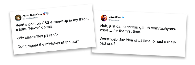
Like CSS-in-JS before it, the idea of “atomic” or “utility-first” CSS provoked an unexpectedly visceral response in some prominent corners of the web design community. (Dave Shea is the creator of the CSS Zen Garden.)
Semantic HTML or reusable CSS: Pick one
But on reflection, the dogma of semantic HTML never really aligned very well with the reality front-end development. You often want to use consistent styling for things with completely different semantics.
Is there a semantic connection between these two things?
A strictly semantic class like .contact or .restaurant can’t be reused for anything else, by
definition. You could call this a .card or something, but that refers to its presentation. What
these two things have in common is that they’re presented the same way. So you have to choose
between semantic purity and reusability: “Semantic HTML” is at odds with the whole idea of a
scalable and composable design system.
In his post CSS and Scalability, Adam Morse writes:
Content semantics have nothing to do with visual styles. When I used to build things with legos I never thought ‘oh this is a piece for an engine block’ I thought ‘oh cool this is a 1x4 blue lego and I can do anything I want with it’. It didn’t matter if I was building an underwater aquanauts base or an airplane — I knew exactly how to use that lego block.
With the right set of “lego blocks”, a single stylesheet can accommodate an evolving application without having to change much or at all. Traditional CSS has never scaled in that sense: It’s always grown linearly along with markup, with lots of repetition and lots of opportunities for inconsistency.

Bonus tip: This is a really good book and you should read it.
Adam Wathan, who I first encountered as the co-author of the excellent book Refactoring UI, was thinking along these lines in 2017. In his article CSS Utility Classes and “Separation of Concerns”, he walks us through his evolving approach.
Like me, he starts out having internalized the religion of semantic HTML. But he describes how in
reality he’s had to become less and less strict about avoiding presentational class names. He points
out that we gave up the game on semantic purity as soon as we became comfortable with class names
like .card and .stacked-form:
There’s no pretending that
.stacked-formis any more “semantic” than.align-right; they’re both named after how they affect the presentation of the markup, and we are using those classes in our markup to achieve a specific presentational result.
The crux of his argument is that “separation of concerns” between HTML and CSS is beside the point: They’re both concerned with presentation. The real question is whether your CSS depends on your HTML (which defines arbitrary class names that the CSS needs to reference), or your HTML depends on your CSS (which defines a limited set of class names that the HTML needs to use). The first way, your HTML is seen as fixed, and can be used with any CSS, à la Zen Garden. The second way, your CSS is fixed, and can be used with any HTML. And he asks:
For the project you’re working on, what would be more valuable: restyleable HTML, or reusable CSS?
This seems like an easy choice to me. Outside the artificial confines of the CSS Zen Garden, approximately nobody has ever redesigned a website by writing a new stylesheet for the existing markup. But while chasing that fantasy, we’ve given up the ability to reuse our existing CSS classes, which would be far more valuable. As Adam Morse writes:
When I read about or listen to ideas on how to scale an app’s CSS — most of the talk is about how to write CSS. The real way to scale CSS, is to stop writing CSS.
And the only way to “stop writing CSS” is to come up with a way of composing and reusing your existing CSS.
Wathan points out that with utility classes, not only are you able to get off the treadmill of adding more and more CSS to your codebase, but — as a side benefit — you get the constraints that you need to implement a design system.
You could try and enforce consistency through variables or mixins, but every line of new CSS is still an opportunity for new complexity; adding more CSS will never make your CSS simpler.
If instead, the solution to styling something is to apply existing classes, all of a sudden that blank canvas problem goes away.
When everyone on a project is choosing their styles from a curated set of limited options, your CSS stops growing linearly with your project size, and you get consistency for free.
He concludes by describing the home-grown framework he’s settled on. Like Tachyons, it almost exclusively relies
on stringing together utility classes like .p-2, .text-xs, and .bg-warning. In closing, he
mentions that he’s open-sourced his framework and called it Tailwind
CSS.
Tailwind CSS
I was intrigued by Tailwind, but still very skeptical: This was really not what I thought I was looking for. It went counter to the religion of web standards that I had internalized over nearly two decades. The white-hot wrath of Jeffrey Zeldman’s disapproval was making me sweat from 6,000 kilometers away:

Jeffrey Zeldman is not amused by our desire to make a better life for ourselves and our colleagues.
SORRY. I disagree. Nonsemantic classnames that refer to visual styles will always be a bad idea.
Slapping a visually named class on every item in your markup may indeed make your HTML easier to understand for a future developer who takes over without talking to you, especially if you don’t document your work and create a style guide. But making things easier for yourself and other developers is not your job. And if you want to make things easier for yourself and other developers, talk to them, and create a style guide or pattern library.
But I actually do think it’s my job to make things easier on myself and my fellow developers, if I can. And I don’t agree that the problems we’ve enumerated with large CSS codebases can be solved with better communication or better documentation.
I had read somewhere that Tailwind was the sort of thing you had to actually try out to understand. So I took Tailwind out for a spin, expecting to hate it.
I’ve never looked back.
The first thing I noticed was how ergonomic it is to work in Tailwind.
As with CSS-in-JS, it’s a relief to no longer have to be constantly coming up with names for things.
How much of your life has been wasted coming up with names for single-use abstractions like
.card-details__inner-wrapper--selected? In Tailwind you just make an anonymous div and put
self-explanatory classes on it.
The clarity and simplicity of having the styles right there in front of you, in line with the markup they’re affecting, is a breath of fresh air. It’s a significant cognitive burden to keep track of what bit in this file applies to which bit in this other file — even when you’re starting with a blank slate, let alone when you have thousands of lines of CSS to sift through. The constant mental effort that this context-switching requires is something that you underestimate until you’re freed from it.
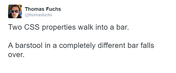
With Tailwind, you never have to wonder about the scope of your changes, or worry about unintended effects. No more knocking over bar stools in completely different bars.
Tailwind’s editor tooling is excellent — the official VS Code extension provides inline autocompletion for the full set of utility classes, complete with color previews.
Unlike CSS-in-JS, with Tailwind you’re actually applying CSS classes by name; and that shows in several respects that make it a big improvement over JavaScript-centric frameworks like Theme UI or Styled Components.
For one thing you’re able to use your utility classes as building blocks in a regular stylesheet,
using the @apply directive. So you get the consistency benefits of your design tokens whether
you’re styling a React component, or writing a traditional CSS style definition.
h2 {
  @apply text-xl font-bold font-serif my-4 border-b-2 border-black;
}

.button {
  @apply rounded-full border border-primary px-5 py-2;
}
That turns out to be important for a couple of reasons. First, as we saw earlier, traditional CSS stylesheets make total sense for documents, and that extends really to any long body of text, like a blog post. These are often stored in Markdown format anyway, so you don’t control the HTML and a stylesheet is the only option for styling your headings, lists, links, blockquotes, etc.
There are also situations where a CSS abstraction makes more sense than a component abstraction. For
example, you might want a button-like style that you can apply to both <button> and <a>
elements. You could make a polymorphic <Button> component that encapsulates the styling and is
able to return either of those tags, but I’ve gone down that road and let me save you the trouble.
It’s much easier to just write <button class='button'> and <a class='button'>.
CSS-in-JS systems deal awkwardly with essential CSS features like media queries and element states
like hover and focus. Since Tailwind is just CSS at the end of the day, it doesn’t have this
problem. As a bonus, Tailwind’s shorthand for pseudo-classes and responsive breakpoints is ergonomic
and easy to read and write:
// Darker background on hover
<button class="bg-primary-500 hover:bg-primary-700 ...">...</button>

// Width of 16, 32 on medium screens, and 48 on large screens
<img class="w-16 md:w-32 lg:w-48" src="..." ></img>
Implementing your own design in Tailwind is a pleasure. No more tearing your hair out trying to override the the default styles: Instead, you start with a clean slate and you build up your own styles using a customizable menu of sensible options for colors, size, spacing scales, and so on.
The depth of Tailwind’s customizability blew me away. Not only can you tweak the design tokens to your heart’s content, but you have full access to the underlying machinery. If you need utility classes that Tailwind doesn’t include, you can have it generate whatever you want.
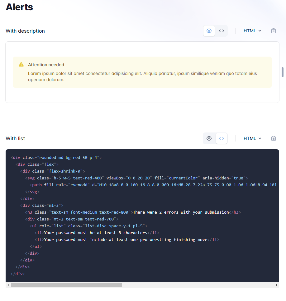
Tailwind UI is Tailwind’s answer to the component libraries offered by frameworks like Bootstrap or Semantic UI.
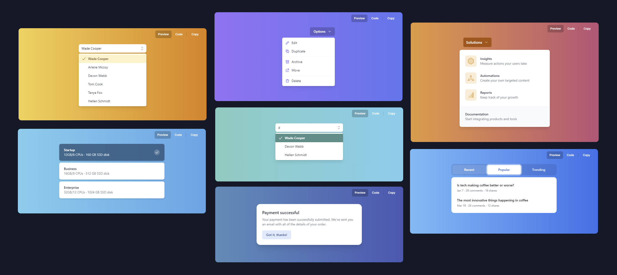
It’s a library of professionally designed components that goes beyond the basics of buttons, dropdowns and modals, to include fully fleshed-out examples of common application UI requirements like sign-in forms and dashboards; marketing website elements like pricing pages and logo clouds; and ecommerce components like shopping carts and checkout forms. A few components are free, but full access requires a paid account; this in turn supports ongoing development of the open-source framework, and has allowed Adam Wathan to quit his day job and work on Tailwind full-time.
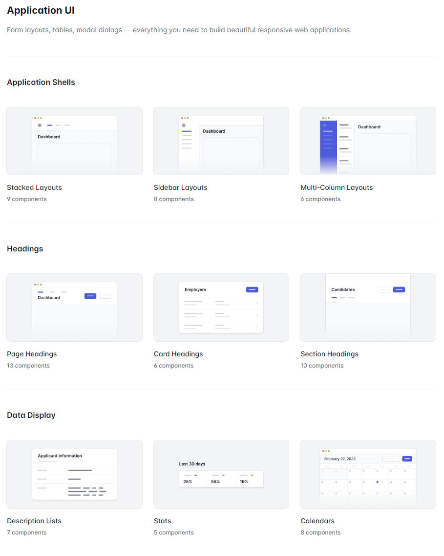
Tailwind UI gives you lots and lots of thoughtfully designed copy-and-paste examples of markup using Tailwind CSS for common application and website components.
Most of the Tailwind UI components are just static HTML markup with curated CSS classes, which you copy and paste into your project and customize as needed.
For more complex interactions requiring JavaScript, Headless UI is an
open-source set of unstyled components designed to be used with Tailwind. Like Reach
UI and Adobe’s React Aria,
it’s intended to prioritize accessibility. Available for both React and Vue, each component is
shipped as a set of composable parts. For example, here’s the autocomplete-style Combobox:
<Combobox value={selectedPerson} onChange={setSelectedPerson}>
  <Combobox.Input onChange={event => setQuery(event.target.value)} />
  <Combobox.Options>
    {filteredPeople.map(person => (
      <Combobox.Option key={person} value={person}>
        {person}
      </Combobox.Option>
    ))}
  </Combobox.Options>
</Combobox>
These elements can be put together in a variety of different ways, styled any way you want, and even interwoven with whatever HTML markup you need. This is a vast improvement over the take-it-or-leave-it components from libraries that I’ve used in the past, which have invariably been difficult or impossible to restyle and customize.
Headless UI finally solves the problem of interactive components that are tightly coupled to a specific visual style.
Unexpectedly, the holy grail
For me, the upside of working with Tailwind is somehow more than the sum of its technical advantages. At a visceral level it just feels comfortable, feels like the right tool for the job, in a way that nothing else ever did. Whoever said that you couldn’t really get Tailwind until you actually used it was right.
I’m as surprised as anyone to find myself here: While Tailwind maybe wasn’t the sort of solution I thought I was looking for, it’s definitely the solution I needed. It checks all my boxes, and then some; and at this point it’s hard for me to imagine using anything else.